More than a Water Leak: A Home Renovation Q&A with Hibou Design
May 16, 2024 | Carpet One Floor & Home
Design by HIBOU DESIGN + CO | Photography by DREW HADLEY
In the world of home remodeling, it is often the unexpected that triggers the most transformational changes. What began as a minor water leak in a traditional home paved the way for a complete main floor renovation, ultimately shaping a brighter, more spacious, and functionally aesthetic environment for a bustling family of four.
Dive into our exclusive Q&A with designers Eugenia Triandos and Korina Khamis of Hibou Design + Co as they take us through their latest home renovation.
Q: What were the goals for this project?
A: This main floor renovation project aimed to address the client’s desire for a more open and airy space in their traditional home. Our objectives were aimed at completely renovating the main floor, including structural adjustments to open up enclosed areas. Essentially we aimed to create a brighter, more spacious environment tailored to our clients' needs. Given that they have two young boys, we sought to redesign the floorplan while maintaining a designated “mudroom" area for them to easily transition in and out of the house.
.jpg?rnd=6650)
Q: Can you tell us about the inspiration behind the project? Were there any specific themes or ideas that guided your creative process?
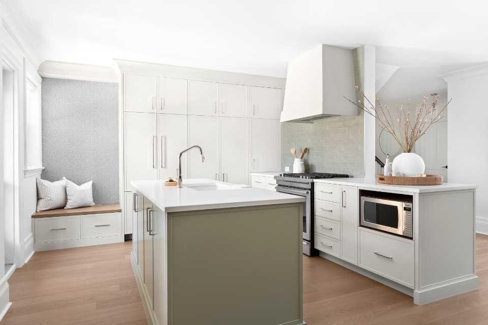
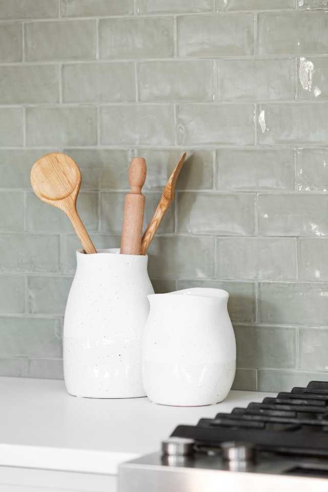
A: The inspiration behind the project centered on creating an airy atmosphere, aligning with the clients’ preference for light blues and cooler tones. To complement this, we veered away from an all white palette, and opted instead for a taupe kitchen and introduced a green island and backsplash for a touch of color. We enhance contrast with wood accents and darker furniture pieces, balancing the overall aesthetic.
Q: How did you approach the space planning and layout for this project? Were there any unique challenges you had to address?
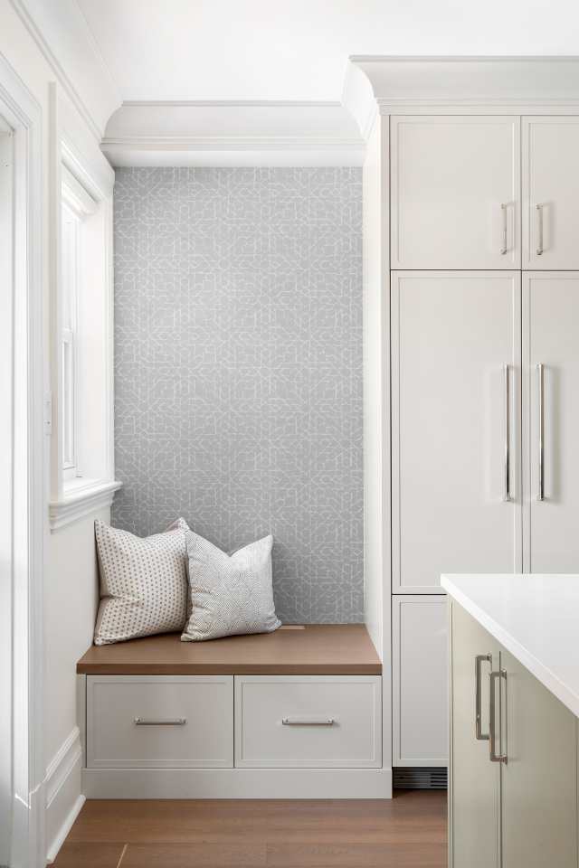
A: The initial layout featured a division between the dining room and kitchen, resulting in limited functionality, especially with a small kitchen and tight patio door. Recognizing the family’s active lifestyle, we reconfigured the layout by removing walls to improve flow, and introduced a custom bench near the patio door that doubled as a mudroom with ample storage space—a small yet essential addition enhancing the space's utility.
Q: What are some things you consider when choosing flooring for your design projects? What made you choose this specific flooring for the space?
A: When selecting flooring, we always prioritize both durability and aesthetics. White oak is always a great go-to; it’s a very hard, durable wood that can create a different aesthetic depending on the selected tone. Opting for a medium tone strikes a balance between formal and casual, ensuring versatility while minimizing visible wear and tear—a crucial aspect to consider when you’re designing a space for a busy family environment.
Q: Lighting can significantly impact the mood and functionality of a space. How did you approach lighting in the home to enhance the spaces and create the desired ambiance?
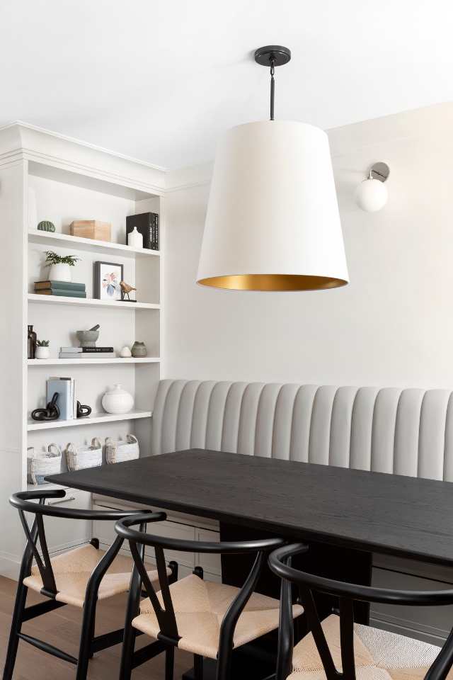
A: We always emphasize layered lighting to accommodate a variety of different needs and moods. In the dining room alone, we incorporate overhead lighting, wall sconces, and a suspended fixture, providing flexibility for different occasions. This approach allows for adjustable and dimmable lighting at different heights, catering to diverse settings.
Q: What materials, colors, and textures did you incorporate into the design, and how did they contribute to the overall atmosphere of the space?
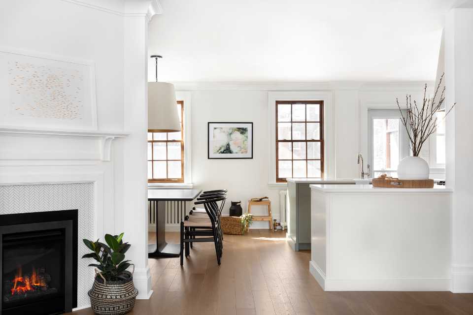
A: We didn’t want a very loud space, so we set the tone for a “quiet” atmosphere by incorporating pale and cool colors. To bring in some dimension and contrast, we incorporate textures and patterns through the wallpaper, but again, nothing too graphic or loud. The inclusion of wood accents and a channel-back banquette adds depth and character without distracting from the overall serenity of the space.
Q: How did you ensure that the design not only looked aesthetically pleasing but also met the functional needs of the occupants? Were there any specific challenges you faced in achieving this balance?
A: Balancing aesthetics with functionality was crucial, especially in optimizing the entryway spaces and accommodating the family's lifestyle. Addressing the lack of natural light at the front, we reconfigured the layout to allow light to flood through the back. Practical considerations had to be made, such as incorporating ample storage on the built-ins that are placed between the living space and the main hall; those custom storage spaces encompass a lot of different hooks and pullouts tailored to our client's needs. The custom bench is also highly practical for them when they’re coming in and out of the home.
Q: How do you approach choosing color schemes for your designs? Do you follow the 60-30-10 color rule?
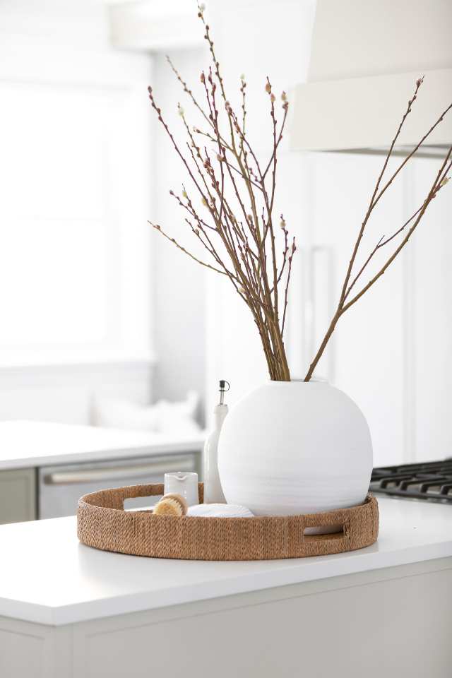
A: Our approach involved creating contrast within a neutral backdrop to avoid overwhelming visual clutter, hence the layered neutrals, the taupe kitchen, and the white walls. This neutral canvas provided the perfect backdrop and opportunity for subtle pops of color and texture to shine through the wood accents and furniture, adding depth and character to the space without overpowering it.
Q: What advice would you give to homeowners looking to achieve a similar design aesthetic in their own spaces?
A: For homeowners aiming for a cohesive design, prioritizing a focal point while maintaining a neutral backdrop is key. Selecting one or two elements as focal points, such as a bold island color or distinctive backsplash, adds character without overwhelming the space. The number one mistake that new homeowners often make is that they love independent pieces that provide a lot of character and when put together, it creates a very busy atmosphere. You have to be selective when it comes to pops of color or characteristic elements that you want to incorporate within your space.
As you embark on your own home improvement journey, considering the lessons from this remodeling project, explore the Carpet One Floor & Home catalog for your next flooring solution. Maybe you're looking for durability and aesthetic appeal, just like the medium-tone white oak flooring used in this house or maybe you're hoping to discover a bright mosaic tile. Whatever your style preferences, we have the perfect pick for you! And for more insightful designer advice and inspiration, don't forget to check out our design magazine.
Hibou Design + Co: Eugenia Triandos and Korina Khamis are the co-founders of the Montreal-based multidisciplinary design firm, Hibou Design & Co. With over a decade of collective experience, they have become known for creating stylish and well-curated interiors. The firm provides bespoke residential design services throughout Canada and North America. Known for their ability to create spaces that are both functional and aesthetically pleasing, Hibou Design & Co ensures every project is tailored to their clients’ lifestyles and preferences.