Create a Monochromatic Interior Design Color Scheme
May 19, 2022 | Carpet One Floor & Home
Creating a monochromatic color scheme in your home is a great way to ensure a more cohesive design style. Even though monochromatic color schemes are trending amongst amateur and professional interior designers, there are still some misconceptions when it comes to creating this color combination in your space.
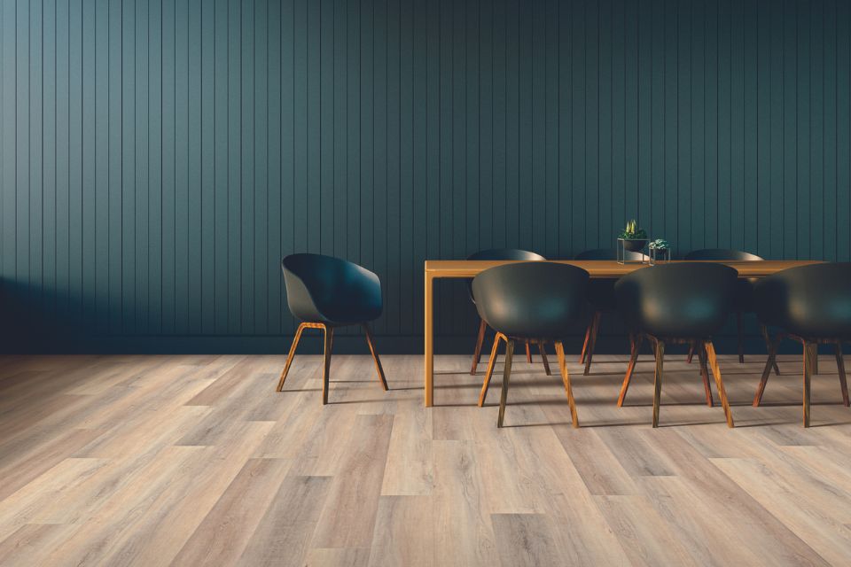
What is a Monochromatic Color Palette
In interior design, a monochromatic look refers to a color scheme that primarily uses different shades, tints, and tones of a single color throughout a space. The word "monochromatic" is derived from the Greek roots "mono," meaning one, and "chroma," meaning color. This design approach creates a cohesive and harmonious look by sticking to variations of a single hue, without introducing contrasting colors.
To create a a perfect monochromatic color scheme, interior designers choose a base color and then explore its lighter and darker shades, as well as its muted and more intense versions. For example, if the chosen base color is blue, the palette may include pastel blues, navy blues, aquamarine, and other related tones.
Why Monochromatic Color Schemes Work
Elegance and Simplicity: Monochromatic color palettes create a sense of elegance and simplicity. The lack of contrasting colors allows the eye to focus on the subtle variations and textures within the chosen hue.
Visual Cohesion: A monochromatic palette promotes visual harmony throughout the space, as all elements are derived from the same color family. This cohesiveness contributes to a serene and balanced atmosphere.
Accentuates Texture and Form: When working with a single color, the focus shifts to textures, patterns, and shapes in the room. Elements like textiles, furniture design, and architectural features become more pronounced and noticeable.
Amplifies Light: Monochromatic spaces tend to reflect and amplify light more effectively. Light bounces off the surfaces, creating a sense of openness and airiness.
Easy to Execute: For those who may find selecting complementary colors challenging, monochromatic color schemes offer a straightforward approach that still yields stylish results.
To avoid a flat, single-color space that leaves you feeling overwhelmed, we’ve broken down the process of creating a dimensional monochromatic color scheme into two easy steps.
STEP 1: Choose Your Monochromatic Color Scheme
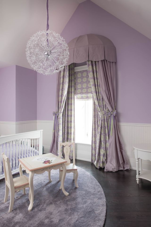
Design by WILLIAM MACDONALD Photography by STEPHANI BUCHMAN
A monochromatic decor offers a timeless and sophisticated look that can suit various design styles and preferences while creating a tranquil and harmonious ambiance. Ready to create a monochromatic look for your home?
Choose Your Base Color
The most crucial part of establishing a monochromatic color scheme is choosing your base color. The most popular base colors are typically neutrals, as they are the easiest to match and can make your space appear larger. Of course, that’s not to say that a brighter hue is impossible to use as a base. One of the best things about creating a monochromatic design is that it can be applied to virtually any design style or aesthetic, so if your taste runs more toward the colorful side, don’t be afraid to bring that into your space.
Before deciding on your color scheme, it’s important to consider the elements that are already in the space that you don’t intend to change. Do you have warm-toned hardwood floors? Consider choosing a warm beige or another neutral tone as your base. Or maybe you have a grey bed frame you plan to keep – consider building your color combination around it for a more cohesive design.
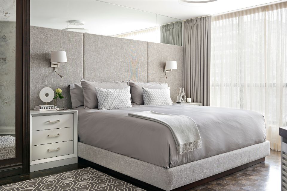
Design by SARA BEDERMAN Photography by MIKE CHAJECKI
Add Variation to Your Base Color
Once you consider the elements that you plan to keep in your space and use them to choose your base color, it’s time to find the various shades, tones, and tints that will help you bring your monochromatic color combination to life. Incorporate various shades of the chosen color to add depth and dimension to the design. This prevents the space from feeling flat and one-dimensional.
.jpg?rnd=9224)
The easiest way to identify those accent colors is by going through each of the color variation categories with your base color in mind. These categories are:
Hue - Hue is one of the main attributes of a color and refers to the dominant wavelength of light that gives a color its distinctive quality. It is what we typically refer to when we use color names like red, blue, green, yellow, etc. In essence, hue is the purest form of a color, and it is what differentiates one color from another on the color spectrum. Hue is your base color. This is the color you will build your monochromatic color schemes around.
Tone - In the context of color, tone refers to the lightness or darkness of a color. Tone is your base color after grey has been added. The value of your base color will become more muted with the addition of grey. Tone is crucial in creating depth, contrast, and visual interest in your living space. A well-balanced use of tones can influence the mood and atmosphere of a space, creating visual harmony and enhancing the overall aesthetic appeal.
Shade - Shade is your base color after black has been added. This process results in a deeper, richer, and darker version of the original color. Shades are an essential component of color schemes as they provide contrast, depth, and visual interest when used alongside lighter tones and tints within the same color family. Shading can balance brighter hues and make them feel more grounded.
Tint - Tint is your base color with white added. The value of your base color will be lighter with the addition of white. This process results in a paler, softer, and lighter version of the original color. Tints are an important component of color palettes. In home decor, tints are often used to achieve a soft, airy, and calming atmosphere. The muted color created by with white added will create monochromatic interiors with a sense of lightness and brightness in a space.
These four-color variations are the key to creating a dynamic monochromatic design, rather than a single hue room which can make your space feel stiff or visually boring.
STEP 2: Use Textures and Patterns to Create A Dimensional Monochromatic Room
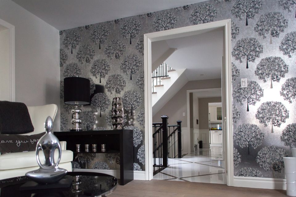
Design by CATHERINE LUCIE-HORBER
While establishing your color scheme is certainly the most important part of creating a monochrome color palette, ensuring that your space has dimension and is visually interesting is also crucial. To avoid a flat-feeling room, be sure to utilize the different shades, tones, and tints associated with your base color. While incorporating your color scale, consider using different patterns, textures, and prints to help you create an even more visually dynamic design.
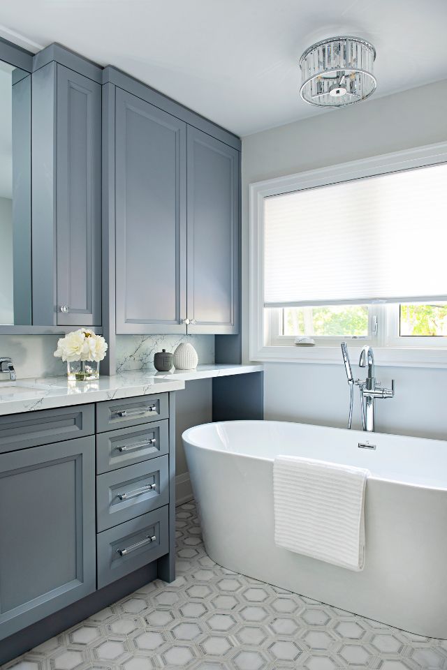
Design by EVELYN ESHUN
Introduce Textures
There are several ways to introduce patterns, textures, and prints to your space. How you utilize these options will depend upon your personal taste and your chosen color scheme, but some ways to incorporate pattern and texture are:
Wallpaper. Wallpaper is an easy way to add pattern and even texture to your monochrome design. Consider doing a metallic print to move light around your space, or a large, printed pattern that utilizes different shades, tints, and tones of your base color.
Wall or Floor Tile. Tile is an excellent way to add some different textures to your space, whether it’s on the floor or the walls. Consider using an interesting pattern as a backsplash above the kitchen sink or a herringbone pattern on your floors to bring even more dimension to the room.
Pillows, Blankets, and other linens. Pillows, blankets, and other linens are a great way to add different shades, tones, and tints while also adding in some new textures or patterns. Look for patterns within your color arrangement and elements like fringe or beads for an added element of interest.
Visually interesting décor. Whatever your style, adding decor pieces like vases, lamps, statues or other important collectibles is a good way of not only showing your personality but adding an extra visual element to your monochrome design.
Perfect Flooring for Monochromatic Interiors
For an entire room, where the color palette primarily consists of different shades and tones of a single color, the choice of flooring can play a crucial role in enhancing the overall aesthetics and cohesiveness of the space. The flooring should complement the chosen monochromatic color scheme while adding texture and visual appeal. Here are some excellent types of flooring options for your own home design:
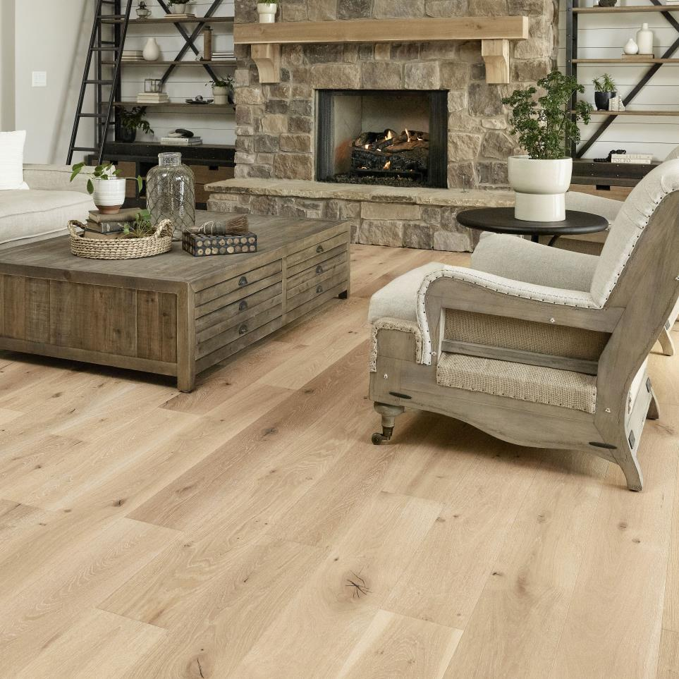
Hardwood Flooring: Hardwood floors, particularly in lighter or darker shades that match the monochromatic color scheme, can add warmth and elegance to the room. The natural grain patterns and variations in wood contribute to the visual appeal without introducing contrasting colors. This oak floor ties in perfectly with the natural tones of this monochromatic room.
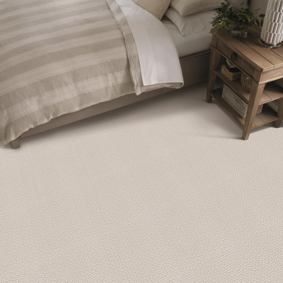
Light-Colored Carpet: A plush, light-colored carpet in the same color family as the monochromatic scheme can create a soft and comfortable feel in the room. A pale neutral carpet or one that closely matches the dominant hue can work well. Combine beige tones with a soft beige carpet like this one and you'll have a bedroom that is calm and relaxing.
Porcelain or Ceramic Tiles: Tiles in shades that align with the monochromatic color palette offer a smooth and clean look. They can be used in various finishes, such as matte or glossy, to add subtle texture to the floor. Tile floors work in kitchens, dining rooms, bathrooms and other spaces that get a lot of moisture.
Natural Stone Flooring: Stone floors, like marble, travertine, or slate, can add sophistication and a touch of luxury to a monochromatic room. Opt for stone tiles that are within the same color family as the chosen hue.
Laminate Flooring: Laminate flooring comes in a wide range of colors and patterns, including options that can mimic the look of hardwood, stone, or tile. Choose a laminate flooring that aligns with the monochromatic color palette.
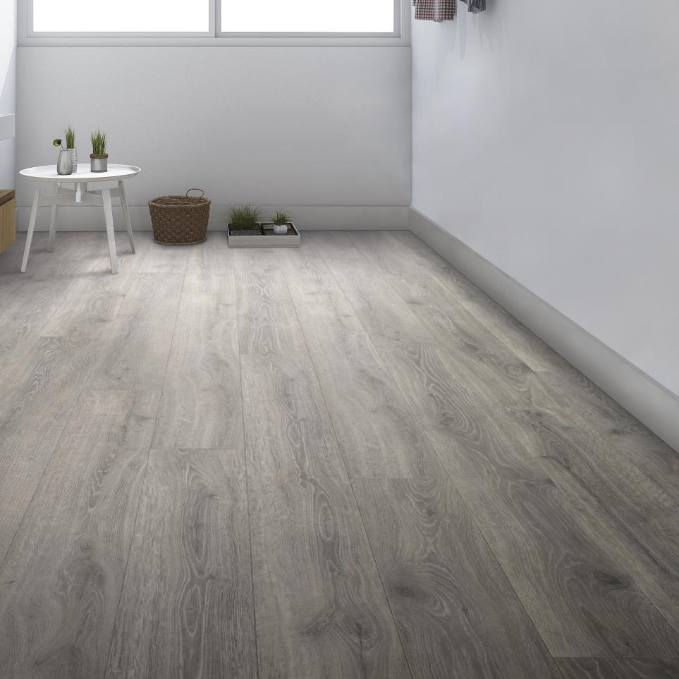
Vinyl Flooring: Vinyl flooring offers versatility and affordability. It is available in various colors and patterns, making it easy to find one that fits the monochromatic scheme. Try luxury vinyl floors in an eye catching herringbone pattern to add a bold statement to your monochromatic color scheme interior design.
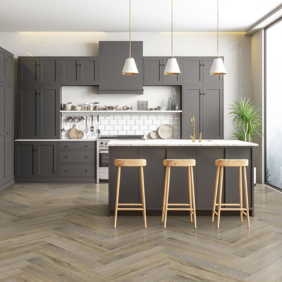
When selecting the flooring, consider the overall style and theme of the room. Additionally, pay attention to how the flooring interacts with the walls, furniture, and other elements in the space. The goal is to create a harmonious and visually balanced environment where the monochromatic color scheme is enhanced rather than overshadowed by the flooring choice.
Looking for more interior design inspiration? Check out our latest blogs from Beautiful Design Made Simple to explore more trending design styles and learn about the latest in flooring technology.